Mega Makeover 2 and success!

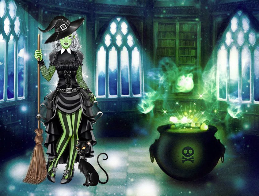
Mega Makeover Halloween

Wow! Players loved our last game. 

These days is very difficult to get the attention and involvement of players but our Scary Lilly seduced them. Lilly motivates us to improve MMO’s concept and make it more appealing and entertaining.

Since the game concept and the code is almost the same as MMO-1, all the merit belong to the artists. They really did an amazing job.

Artists:
Eli Basanta (doll and hairstyles)
Estela Gaona (dresses and accessoires)

>> Play MMO-2 here

Gamelab: day one

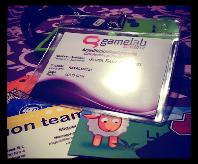
And so, Gamelab has begun. The biggest and most important videogame event hold in Barcelona opened its doors today at Catalunya Plaza Hotel. Today’s topics moved loosely around the mobile gaming issue. Let’s not even try to grasp a whole view on the day’s speeches, but instead let’s focus on the two best moments from a personal point of view.

For us, a humble tiny studio, those conferences about expanding to asian markets, or stretching the brand until you get profit of plush toys, were kind of celestial voices whispering about their fairytale world. But at lunchtime, the bunch of guys who struggle day by day just like us, (Lucera Project, Lemon Team, No2, IDS and with some more ease Ludei) were singing a different tune. A song about plain survival, perseverance, environmental adaptation and “old coder tricks”. It’s been a nice time spent among these buddies and the feeling of being rowing in the same boat is quite strong.


After that, 
the ever caustic and witty Daniel Sánchez-Crespo has shared his worthy point of view on game monetization. He was supposed to talk about Vita, but instead he showed his concerns about the players loosing the perception of game value itself. When selling games at 0.99$ we are putting ourselves in a point where it’s almost impossible to make a living out of them. The Appstore is overcrowded with daily releases, and making those games profitable means to invest the less time possible on them. In the end is a rat race with no way out where the victims are our own wallets and the games’ honor in general. 

On the other hand, as Dani exposed, there are some hopeful horizons in freemium, downloadable contents (DLC), subscriptions and the typical retail market from the console environment.
The question is… now that the mobile (iOs) users are used to pay cheap prices and they have a distorted view on the game value, is there a way back that allows the studios to quit from working for peanuts? Is the games respectability too eroded by all the mediocre stuff gathered together in the Appstore during this time?  
And most important, should I go back to my father with a gloomy gaze and tell him –You were right. Living from selling games at 99 cents was naive and I’ve been a fool for believing that.– ? 


Zombie Cells – Character Design (2/2)

Now we’re going to conclude our little analysis on character design, using the case of Zombie Cells as a reference.

In the previous entry we covered the first stages of char design. That includes the broad brainstorming, pencil sketching, first approaches and absurd ravings that must be identified and rejected before you find yourself falling in love with them.

In this stage of development we chose to depart from that comic/cartoonish style, that resembled Angry Birds, and try something less raw. We wanted some extra details, but not too much. Plain style is perfect, but there’s also a search for visual identity. You have to come to a balance point between simplicity on one side (works better for humorous purposes), and details, which may move you away from bold elegance but make the uniqueness of the design come into bloom.

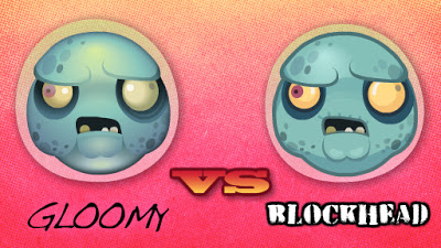
Again some pencil work helps the designs come out more fluent. But once you have figured out the sketch, the basic design in outlines, you have to color it. Here we found a minor issue about color style, that is very illustrative. The first style makes use of gradients and works out better the volumes of the figure. But as you can see, the effect is quite gloomy, making thus the comic effect fade away. Just check out how different do they look, the exact two cells with just a different color style.

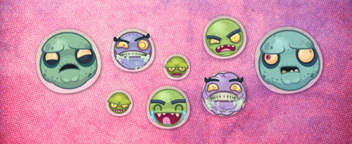
Finally we have to put all the cells together. They are not isolated beings, they must look fine as a group. Having the same visual design is something that we’ll take for granted at this point, but besides this, there’s also the color matching factor. When placed together they have to offer a cool group image (just like them). And assuming is a funny zombie game, we wanted them not to look too grayish or just  having variants over green tones. We wanted the whole zombie palette here, to get the richest variety of tones assuming we’re dealing with necrotic cells.

Enjoy the infection!


Zombie Cells – Character Design (1/2)

In the process of creating a new game/world you come to a moment when you have to settle it with inhabitants. At that moment the possibilities are overwhelming, but you must go down to earth and start placing some boundaries here and there. Once you know which kind of public the game is focusing on, and which kind of metafore would fit the game mechanics, it’s the time to call your pencil to action.
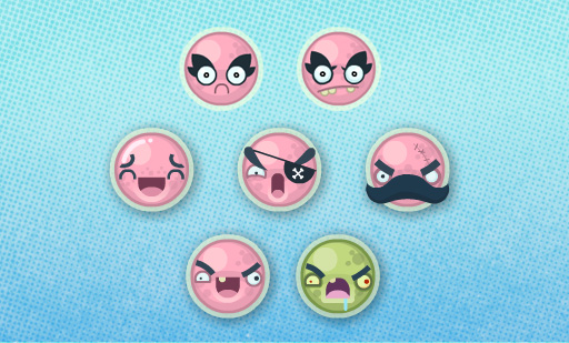
In this case, we had a liquid or low gravity environment, plus a massive spawning of beings. Once we dismiss the spacey theme, we went for the more stimulating body fluids’ setting ;). At some point the word “zombie” came out, and like victims of our time (the zombie golden-age) we just couldn’t help imagining hordes of zombie cells infecting a helpless host. In fact, we imagined the host was Justin Bieber… Down below are the first attempts.

The idea here is to try different approaches. To see which ones fit best and trace a line of action. Pencil is still the quickest tool. Although your inner child may just wish to start using colours, it’s better to try as many different styles in the less time possible, so let’s keep computer away.
OK, this time my inner child won over the battle, so I jumped quickly to Flash. That’s why the first two attempts, (down here) are just crap. Then I tried a simple cartoony style, most in the mood of Angry Birds. You can notice that specially in the last two of them.

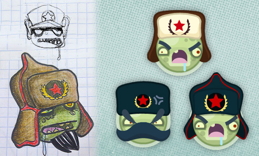
And then… the magical moment, when everyone goes crazy. At some point you may come to a mad idea, an absurd concept that may be very funny. And then again, cold miss Logic comes back and hits your face with her glove. “Did you really think that zombie cells also needed to go soviet?”. – “Uhmmm… I guess it was not necessary, but it was cool as hell”.

It’s important to go through this phase in the early stages of design, or else, this mayhem will make you waste an undefined amount of precious time. In this case we dismissed the idea due to some deep and raw concerns about disappointed expectation.
In the second post about character design we’ll reveal the final stages of zombie cells infection. Take care!

1 million game plays

We are not millionaire yet but one of our games has made it to the top. It’s been played one million times.

The average play time for this game is 10 minutes. If we do some calculations we’ll see that altogether we have contributed to mankind with 19 years of accumulated make up fun. That’s amazing!

Don’t believe me? Check out the stats:

Playtomic stats for Selena Gomez Make Up

Too innovative? Brand it!

We’ve been working over the past weeks on a contract involving a serie of make up games. Our expectations were high because these games implement a more realistic approach.

The release of the first game couldn’t be more disappointing. It got a bad rating. So many hours trying to improve the genre and our customer told us that players complained about this new way of applying make up…

After a long sesion of masochism reading all negative comments we came to the conclusion that there was nothing wrong with our game. Basically, players were expecting the usual make up game and nobody told them that this worked differently. We needed to communicate that our games were innovative in an attractive way.

How about choosing a good brand to differentiate them?

“TRUE MAKE UP GAMES” speaks for itself. Besides that, we could produce some animations showing that make up can be directely applied. We synthetised all this in a strong and visually elegant intro. That was not enough, this time we wanted to play rough. What if we use the magic word “NEW” inside an animated star. All those years buying on impulse nonsense at discount stores were not in vain.

The result? Players gave our second game a great rating to . We improved the game without all that expensive programming, additional graphics or modifying the game mechanics. We just changed the perception of the player.

Designing games is all about creating an experience for the players, and that’s for TRUE.

Collaboration with BoomBang!

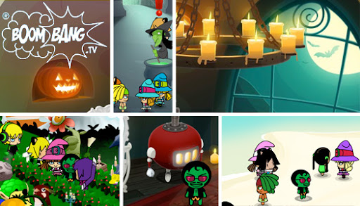
We are very glad to announce that we are collaborating with BoomBang, a great virtual world for the youngsters. Currently, we are developing a frantic new game for them.

BoomBang is a virtual world with over seven years of history, so it’s kind of a veteran on its industry. During this time, kids around the world have made lots of friends and enjoyed all the events that BoomBang’s staff has held. Kids can chat around, pimp up their islands, fill with crazy furniture their houses, play games with exclusive rewards, and take part in thematical events where you can exchange hearts, snowballs, or easter eggs for secret tokens in hidden and bizarre places. All in all, it’s a very cool and entertaining place for kids, as you can see.

For us it’s a great chance to develop for them. Just give us some weeks and you’ll be able to play the wonderful game we are working on right now. We’ll keep you informed!

Spike: hidden fun in Spacebar

It’s a recurring habit to try to make things more ellaborated and complex in the pursuit for quality. We tend to add features to enhance gameplay trying to create a memorable experience, but sometimes, the opposite way works far better to achieve that. It’s well known that when your constraints are tight, you seek for bolder and more creative solutions, struggling to get more from less.
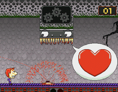
In the case of this game: “Spike: a love story“, you’ll just need to push the Spacebar. Not even in a frenzy mode, and even though, the result obtained is quite impressive: the game turns out to be challenging, entertaining, memorable and above all extremely funny. Don’t wait, stop reading. Play it now!!! (shall you?)

How can you squeeze all that from just a key pressing? The answer comes by blending wisely some winning features. First of all there’s the undelaying humour, there’s a different sketch each 10 seconds or less. Each comic sketch plays with the unexpected, a classic comic formula. You may be waiting for something, and then… you just got busted!!!
From the many different behaviours shown in the game, emanates illusion of life, the sensation you are playing with a living toy. You don’t know what to expect from it and that’s certainly engaging.
Finally, black sense of humour, the morbid fascination of being the bad guy in the movie. Feeling that you are being wicked also keeps you sticked to the Spacebar.

So rather than playability, here we have a great game because of it’s “script”, specially its sense of humour. They say in war and love everything’s allowed, but also in game development! It’s stimulating finding games that create their own formula. It may not be a game for playing for several days, but we’ve learnt a great lesson of humility, and inventiveness from it. Thanks Matzerath for this little great gem!

Game review. Every day the same dream

Finishing our current project Apocalypse Dunk is taking a bit longer than we expected. We are still working hard polishing it and improving its gameplay.

In Ravalmatic, at the office, we love to analyze and review the games that for some reason we find interesting. I would like to talk about Apocalypse Dunk but since is not ready I’ll have to wait.

This week we discovered a brilliant little game that impressed us much.

Alarm buzzes!! Wake up, get dressed, kiss your wife, fight traffic, and go to work. Day in, day out, it’s always the same and nothing you can ever do will change that. Or will it?

Made in 2009 by Paolo Pedercini of Molleindustria, Every day the same dream is a game with a simple gameplay. The player just needs the left and right arrow keys for movement, and the space bar to interact with people and items when their name pops up at the bottom of the screen.

There is not a tutorial or any guiding on how to play. On other game that would account as a weakness and provoque players to quit. However, this lack of instructions is exactly what makes this game so appealing. The player himself needs to find out how to break the vicious circle.

The protagonist has no face, no personality, and yet there’s something about his situation that makes him instantly identifiable, someone to feel sympathy for. I almost felt a sense of desperation the longer I played as I tried to find something, anything, that would change his life for the better… or even at all.

Maybe if you play this original game and have the capacity to think out of the box you will discover its denouement. That can make your day unique too…
Game analytics

All our games use Playtomic stats. Playtomic is the equivalent of Google Analytics for games and is a great tool for game developers. With it we can go further than just knowing if someone has reached level 225 on Halloween Pairs.
Basically, Playtomic allows us to know on which sites our viral games are published, the geographical distribution of the players, the average time spent playing and how many hits the sponsor of the games gets. Besides this, we can custom it to track almost any kind of event relevant to the game play.
Practical example: How we improved Angry Bee with Playtomic
 
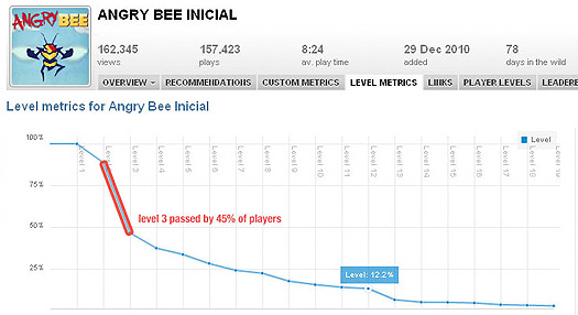
Some days after releasing Angry Bee on a couple of sites, we discovered that we were losing half of the players on level 3.

That wasn’t good. The game was more or less finished and at that point we wanted to avoid redesigning the levels. Nothing was wrong with them. The key issue was to improve the tutorial and reorder the levels. Firstly, we tried something simple.

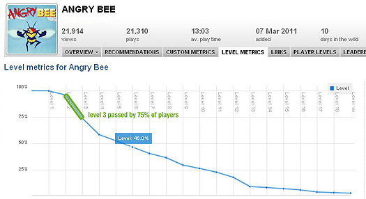
Which effect would have swapping levels 3 and 4?

Bingo! Now the game retained 75% of the players and the play time increased.

Dealing with stats is not all about tracking the amount of plays of our games. If you use them wisely, they can help you to turn your game into a great hit by analyzing the players behavior.