Stepping up performance with TexturePacker
TexturePacker is available on www.codeandweb.com.
Loading time is critical on mobile html5games. Some optimizations can be achieved by reducing the size and the quantity of the assets to be uploaded without giving up quality.
We’ll describe some of the basic things that can be done to minimize loading time. They are quite standard, followed by most developers and include optimizations on these fronts:
The resulting file is called audio sprite. Size wasn’t reduced but the amount of assets indeed, and this helped a lot to keep loading time low.
Game Engine – code
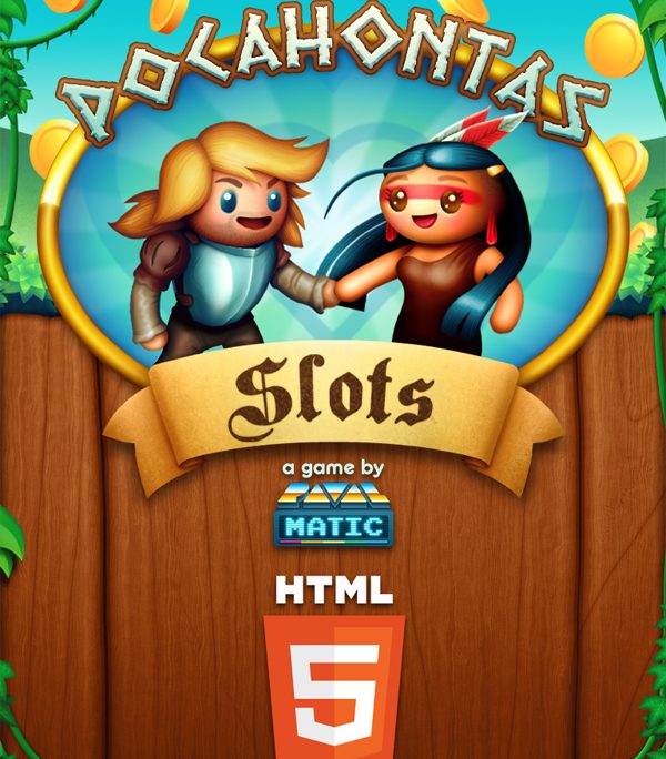
We are currently implementing Phaser for all our html5 games. Our cute Pocahontas Slots doesn’t make use of all the capabilities of this great and robust framework. It doesn’t need the physics module, for example. Instead of referencing this file in the index.html:
phaser.min.js (709kb)
we include the smaller:
phaser-no-physics.min.js (472kb)
Don’t forget to minimize your code too.
Graphics
Choose a good and unique resolution, all assets of your game will be dependent of this initial decision. We usually work with the iPad2 resolution, that is 1024 x 768 px. Our games look alright on desktop and devices with a big display without punishing players with smaller resolution devices.
Did you know about texture atlas?
http://en.wikipedia.org/wiki/Texture_atlas
A good program to generate them is Texture Packer. Once you’ve packed all the images into a texture atlas is time to compress the resulting png. We use an online tool called tinypng for that. This is the last step before releasing the production game.
In case you need a simple background image with a color gradient, for example, let’s say for the sky, generate a bitmap procedurally.
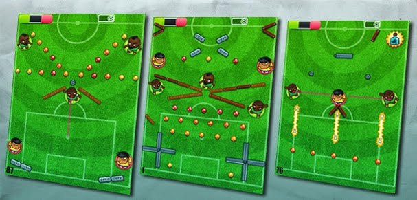
Foot Chinko, our casual approach to football (soccer) games, has the biggest amount of levels ever seen on a Ravalmatic game (+90 levels). Editing them was a major effort per se, but then, arranging them properly wasn’t either a simple task. Without no particular literature about this specific stuff, here’s how we figured we could handle the task.

When you do level design it is key to have a tool that is visual and fast to use. The agility you have when building and testing the levels is very important to produce good stuff. If the task is a heavy and time consuming burden, the levels will consequently be designed in less iterations. That’s what happened in previous games of the studio resulting in more plain level design or an exaggerated amount of time invested on the task.
Enriqueto, had already used the Flash IDE as a visual level design layout that could be later parsed into data about items, their location and contextual level data (seconds, type of goalkeeper, etc.). Testing those levels was as easy as exporting the Shockwave file, running a json exporter, and testing the game on the browser.
Ivan then edited a huge amount of levels in several iterations, discarding some of them due to technical limitations, and getting the most out of sketched ideas and emerging game mechanics. Some of Foot Chinko’s levels felt more skill-demanding and some other had a more random development, but the general idea was to keep a wide variety of levels, offering contrasted flavors. While a random level could be more appealing for a casual player, as the game progressed, those levels should be gradually replaced by more technical ones. If the resolution of an advanced match was just in the hands of luck, the more experienced players could get frustrated. Speaking about Foot Chinko‘s difficulty, it’s really hard to keep objectivity, since your skills will probably be above the average user, so try to make some early testing during this stage of the level design process.
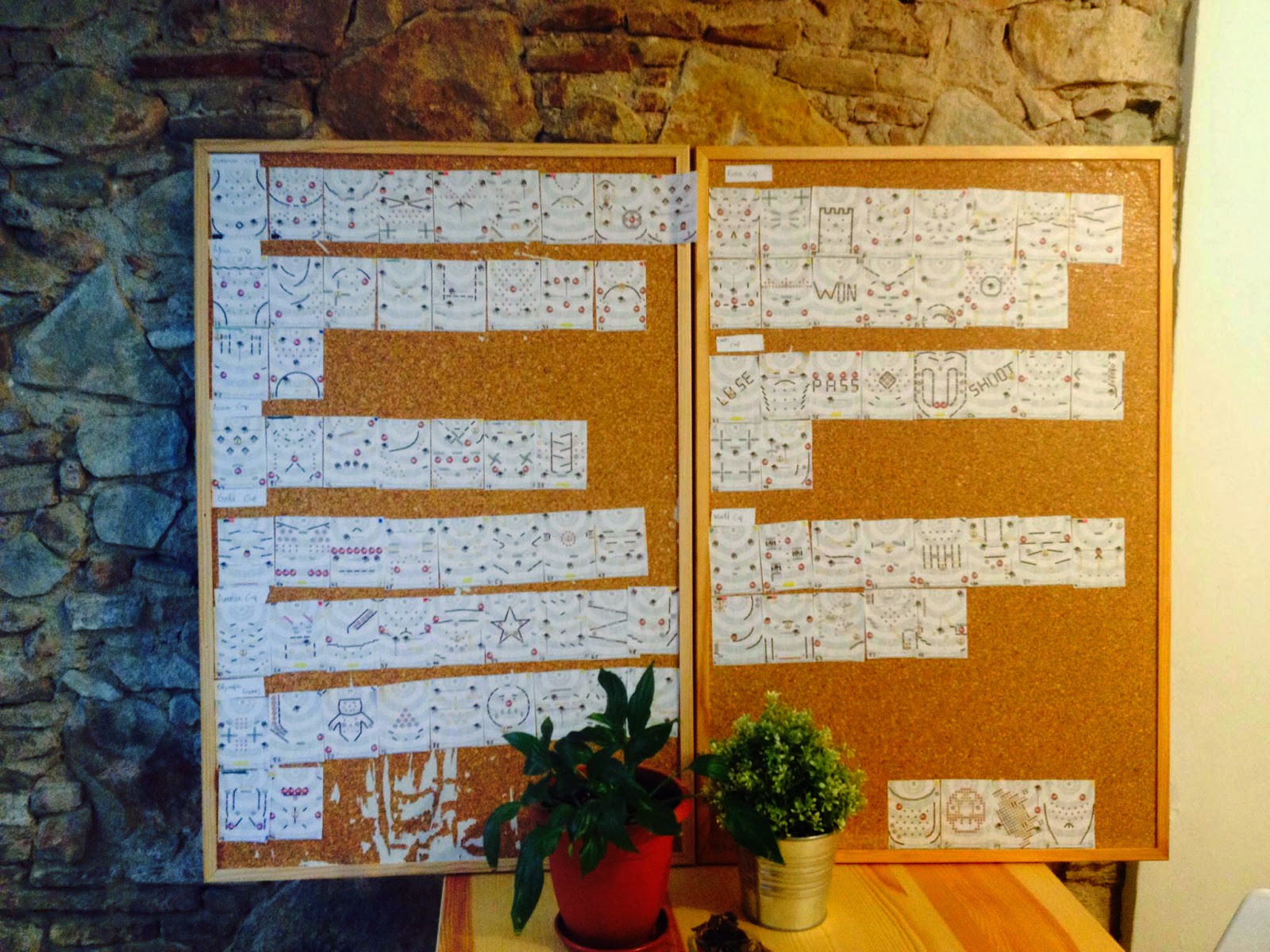
Finally, we printed cards of every single level we had. That helped us to have an overall look, and making groups of levels (passive/interactive, slow/dynamic, easy/hard) and then arranging them alternatively, considering the general difficulty progression during the whole game and the partial difficulty progression of each tournament. Placing the cards on sticky panels was really useful to identify visual patterns and also make agile tweaks. The final step is testing that level progression with players. With the help of metrics we’ll be able to notice if there are some particular tough levels that break the natural progression of the game.
 (The plants had strong arguments about the game flow, but the plastic one showed a deeper analytic vision)
 There are probably better ways to deal with level designing and arranging, so we would be glad to hear your suggestions. Take care!
In this article we’ll cover the producing of game soundtracks and how to guide composers so their tracks fit your game and communicate important aspects.
In this occasion, Daniel Ara, helped us to create the OST of Pocahontas Slots, a light casual approach to slot machines with an indian flavour.
At this early stage you should focus on general aspects like music genre (something that fits your theme), tempo (that matches with the game pace), and duration of the track (in this case we are working on an HTML5 game, so we had to keep the main track below a minute in order to keep short preloading times).
Here’s what Daniel came up with as one of the firsts drafts. One of the other two was eventually used as a secondary track for Bonus Rounds. The other draft had a too dark, ominous spirit, so it didn’t match the game tone.
One of the cool things we found here was the ambient landscape using nature sounds. This is something to always keep in consideration. These kind of ambience sounds will reinforce the projection of the world in your game.
Although the composition was a cool draft, it needed a second iteration with a more casual and lighter ambience.
By the use of piccolo (tiny flute) in addition to indian flute, we not only gave the composition a happier feeeling, but also joined the two colliding cultures of the game: the american indians and the european settlers. Besides that, the low rank frequency of the indian drums that created a constant noise was also reduced.
So we definitely had the indian atmosphere, but still there was a music layer missing. The art, the ambience, the game itself, is a pop revision of the story of Pocahontas, so the music should also remind the casual approach to the theme by using a videogamey accompanying melody. An artificial sound opposing the organic instruments performing in the tune that also gave an even happier feeling.
And finally this is the final version of Pocahontas Slots soundtrack. A positive track that resounds like both indian and the settlers musical compositions (broad commonplaces), with a dynamic tempo, a semi-hypnotic pace, and a videogame touch which reminds that there’s no intention to deliver a pretentious or historically accurate composition.
I hope you enjoy Daniel Ara‘s work and appreciate the process which leads to a soundtrack that matches your game needs.


We are currently editing the last levels and giving the final polishing. Definitely our best work to date. It represents the beginning of something great.
At this stage we are considering the possibility of financing our next game through crowdfunding. Finally we feel confident enough developing games and want to explore new concepts at a higher degree of artistic freedom which wouldn’t be possible when working for clients.
This week we’ve released the first game of a new serie called Mega Make Over.
Players have received it rather coldly. They said that graphics aren’t good and the proportions of the doll are strange. They don’t mention the interface, game concept and its performance.
Their critics overshadow the fact that this game is probably the more complete make game over available out there. Mega Make Over offers a lot of possibilities to edit the clothes, applying make up with the mouse, etc…
We’ve learn the lesson and currently are improving the esthetics for the next game to follow. Probably then, they can make a more equanimous judgement. It will be a Halloween thematic game. Hope to harvest more comprehension for our hard work next time.
Now we’re going to conclude our little analysis on character design, using the case of Zombie Cells as a reference.
In the previous entry we covered the first stages of char design. That includes the broad brainstorming, pencil sketching, first approaches and absurd ravings that must be identified and rejected before you find yourself falling in love with them.
In this stage of development we chose to depart from that comic/cartoonish style, that resembled Angry Birds, and try something less raw. We wanted some extra details, but not too much. Plain style is perfect, but there’s also a search for visual identity. You have to come to a balance point between simplicity on one side (works better for humorous purposes), and details, which may move you away from bold elegance but make the uniqueness of the design come into bloom.
Again some pencil work helps the designs come out more fluent. But once you have figured out the sketch, the basic design in outlines, you have to color it. Here we found a minor issue about color style, that is very illustrative. The first style makes use of gradients and works out better the volumes of the figure. But as you can see, the effect is quite gloomy, making thus the comic effect fade away. Just check out how different do they look, the exact two cells with just a different color style.
Finally we have to put all the cells together. They are not isolated beings, they must look fine as a group. Having the same visual design is something that we’ll take for granted at this point, but besides this, there’s also the color matching factor. When placed together they have to offer a cool group image (just like them). And assuming is a funny zombie game, we wanted them not to look too grayish or just having variants over green tones. We wanted the whole zombie palette here, to get the richest variety of tones assuming we’re dealing with necrotic cells.
Our customers are amazing. Even though we would do it for free, they support financially our passion and keep ordering game after game.
The Raval neighbourhood in Barcelona is becoming the epicenter of realistic make up games production. Currently, our employees are working on a new serie of games called Mega Make Over that will shatter the world.
Besides that, we are collaborating with the production of a multiplayer game for tablets and smartphones. This is a very challenging project, because it will be developed for iOS and Android platforms on any dpi resolution and possible screen size. (The Casio F 91W version is also planned … there is nothing impossible for us).