Zombie Cells – Character Design (2/2)
Now we’re going to conclude our little analysis on character design, using the case of Zombie Cells as a reference.
In the previous entry we covered the first stages of char design. That includes the broad brainstorming, pencil sketching, first approaches and absurd ravings that must be identified and rejected before you find yourself falling in love with them.
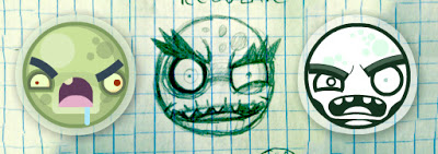
In this stage of development we chose to depart from that comic/cartoonish style, that resembled Angry Birds, and try something less raw. We wanted some extra details, but not too much. Plain style is perfect, but there’s also a search for visual identity. You have to come to a balance point between simplicity on one side (works better for humorous purposes), and details, which may move you away from bold elegance but make the uniqueness of the design come into bloom.
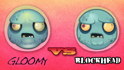
Again some pencil work helps the designs come out more fluent. But once you have figured out the sketch, the basic design in outlines, you have to color it. Here we found a minor issue about color style, that is very illustrative. The first style makes use of gradients and works out better the volumes of the figure. But as you can see, the effect is quite gloomy, making thus the comic effect fade away. Just check out how different do they look, the exact two cells with just a different color style.
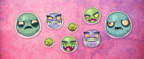
Finally we have to put all the cells together. They are not isolated beings, they must look fine as a group. Having the same visual design is something that we’ll take for granted at this point, but besides this, there’s also the color matching factor. When placed together they have to offer a cool group image (just like them). And assuming is a funny zombie game, we wanted them not to look too grayish or just having variants over green tones. We wanted the whole zombie palette here, to get the richest variety of tones assuming we’re dealing with necrotic cells.


